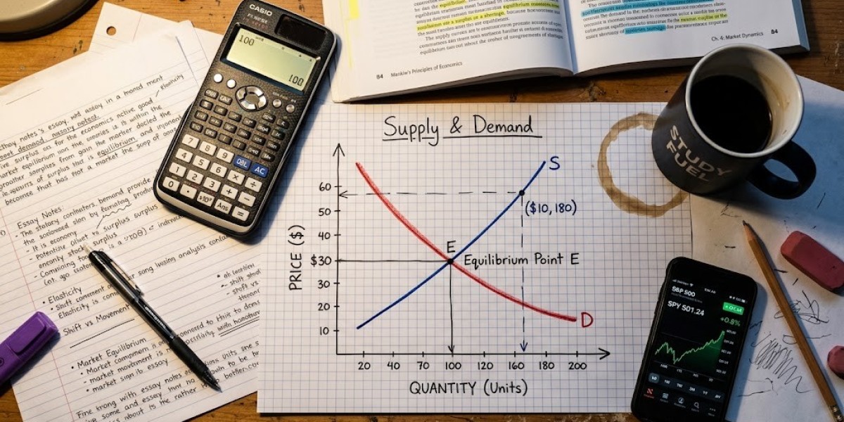

You know the theory. You can probably draw the diagram without looking at your notes. Then the essay question asks you to analyse the effect of a policy, and suddenly that neat little graph from the lecture theatre feels a lot less useful. What exactly are you meant to say once the curve has moved? Why does that shift actually matter, and how do you connect it to something happening in the real world?
That gap between "I understand the model" and "I can actually use the model" is where a lot of first and second-year economics essays start to wobble. It's rarely a lack of definitions. It's not knowing how to turn an abstract relationship into a proper chain of reasoning. Once that click happens, diagrams, equations and data stop feeling like separate hurdles and start working together.
Why models leave things out on purpose
Economic models are useful precisely because they don't try to capture everything. A supply and demand diagram isn't attempting to recreate an entire economy on one page. It isolates the relationship between price, quantity, buyers and sellers so a specific question can be examined without every other factor muddying the picture.
Take something concrete: the government slaps a tax on sugary drinks. A supply and demand diagram will show the equilibrium shifting, but that's really only the opening move. You still need to think about how consumers actually respond to the higher price, how producers adjust, who ends up carrying more of the tax burden, and whether the quantity sold drops in any meaningful way.
Macroeconomic models follow the same logic, just at a bigger scale. IS-LM helps explain the relationship between output, interest rates and policy, but only within its own assumptions. A fiscal expansion might increase aggregate demand on paper, but the actual outcome depends on interest rates, expectations, spare capacity, and half a dozen other conditions the basic model doesn't show you. The model is a starting point for explanation, not the explanation itself and treating it that way changes how you write.
Where students usually get stuck
The most common slip is deceptively simple: describing what happened on the graph without ever saying why. "The demand curve shifts right, increasing price and quantity" is technically correct, but it leaves the reader asking what actually caused demand to move in the first place.
There's also a classic mix-up between a movement along a curve and a shift of the curve itself. Say a bad coffee harvest reduces supply that's different from people simply buying less coffee because the price went up. One changes the underlying conditions of the market; the other is just a response along the existing curve. Mixing these up tells a completely different economic story than the one you meant to tell.
Students also tend to jump from theory to policy too fast. Saying "government spending increases aggregate demand" doesn't tell anyone whether output will actually rise, whether prices will climb instead, or whether borrowing costs will creep up alongside it. You have to walk through the mechanism rather than assume the reader will fill in the gaps for you.
Econometrics adds its own kind of confusion. A regression can show two variables moving together without proving either one causes the other. If unemployment and household spending track each other, something else entirely might be driving both. This is where turning to something like Economics Coursework Help can genuinely help, not as a shortcut to a finished answer, but as a way of seeing how someone else structures that reasoning what gets stated first, what evidence follows, and how the argument holds together from one paragraph to the next.
The theory worth actually knowing
Supply and demand is the foundation, but elasticity is what makes it useful, because it tells you something about the size of a response, not just the direction. This matters hugely when you're discussing taxes or subsidies, since two markets can face an identical policy and still respond in completely different ways.
Market failure adds another layer worth understanding properly. An externality happens when an activity creates costs or benefits for people who weren't part of the original transaction pollution from a factory being the textbook example. The market price reflects the firm's own costs, not the wider cost dumped on everyone else, and a stronger essay explains that mechanism clearly before jumping to whether intervention is justified.
At macro level, IS-LM frames the interaction between the goods market and the money market, while aggregate demand and supply help you examine changes in output and prices together. Fiscal policy brings government spending and taxation into it; monetary policy brings interest rates and central bank decisions. Econometrics shifts the whole task again, because instead of asking what theory predicts, you're asking what the data actually shows and a coefficient needs proper interpretation, not just a definition copied from a textbook.
Getting it onto the page
Before you even sketch the diagram, try explaining the situation to yourself in plain English. If government spending rises, what changes first? What does that affect next? Keep following that chain until you land on the outcome the question is actually asking about. Once you can say it simply, the diagram has somewhere useful to slot in.
Use the graph to sharpen the explanation, not replace it. State what's changed, name the shift or movement correctly, and explain what the new outcome actually means. Don't assume the reader understands why the curve moved just because you labelled the axes correctly spell it out.
When picking a real-world example, don't choose one just because it sounds impressive in a seminar. A subsidy for electric vehicles is a good one to sit with: the interesting part isn't whether demand shifts, it's the price elasticity involved, the supply constraints manufacturers face, and whether the subsidy is actually solving the environmental problem it claims to. Suddenly the theory has something real to explain instead of floating in the abstract.
For econometric work, define your variables clearly before touching the coefficient, then ask what else could be explaining the relationship omitted variables, reverse causality, or a measurement issue, depending on what your module has covered. And read the question wording properly: "explain," "analyse" and "evaluate" are not the same instruction, and evaluation needs building in as you go, not bolted on in a rushed final paragraph.
The mistakes that quietly cost marks
Using a diagram as decoration rather than explanation is a big one if removing the graph changes nothing about your argument, it wasn't doing any work. Treating the model as a guaranteed prediction of reality is another, since real economies carry expectations and institutions that simplified frameworks leave out entirely.
Confusing correlation with causation is easy to slip into, especially under time pressure, so leave room for alternative explanations your evidence hasn't ruled out. Dropping in a real-world example without unpacking it doesn't count as analysis say what it actually reveals. And vague evaluation like "the model has limitations" tells the marker nothing; name the limitation and explain why it changes the outcome here.
Pulling it together
The real shift in thinking is treating the diagram, the equation and the evidence as different angles on the same question: what's happening, why is it happening, and how confident can we actually be in that explanation? A supply and demand model shows direction, elasticity shows size, IS-LM structures the bigger picture, and data tells you what's actually observed.
Real economies rarely behave as tidily as a textbook diagram, and that's not a reason to abandon the model it's a reason to use it with a bit more care. Once you start working this way, the question after drawing a curve stops being "what do I write now?" and becomes "what does this actually tell me?" That's the point where the theory turns into proper economic analysis.